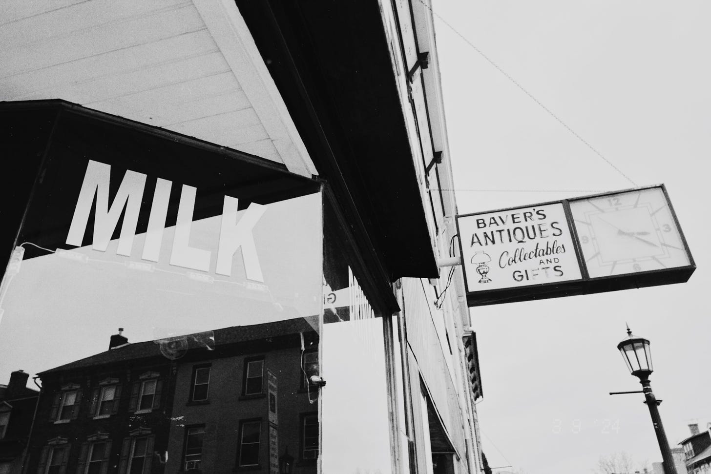
This is the sixt PhotoTalk and we are gonna discuss a photo of fellow Substacker Seth Werkheiser today. He writes Social Media Escape Club
Let’s go!
How to proceed?
Answer the poll with 5 questions and leave your comments afterwards.
Want to have a little more background on the questions in the poll?
Quickly read the introduction
Now, let us know what you think of this photo by leaving a comment. If you have any criticisms, make sure you justify them - so that not just the photographer, but everyone can make up their own minds and maybe learn from it.
That’s it for this week.
Till next time,
DARKROOMS is a reader-supported, weekly photography newsletter. If you enjoy this newsletter, the best way to help it grow and support me is by becoming a free subscriber to receive new posts or upgrade to support my work


A very interesting shot I think. Its like we´re looking at 4 different parts in one frame. I also like a the straight lines are tilted. Adds some tension to the image. Wonder what if would have looked like in color, but I think the choice for black & white is a good one. Make the photo more graphical and suits perfectly in this case.
Hi all - thanks for the kind words here! Much appreciated.
The biggest thing I did here was getting myself out of the middle of the sidewalk and up against the building, you know? To really get a new perspective that I’ve never had before by getting my shoulder up against the window of this little food shop (hence MILK).
The day was very overcast, too, so the sky was just gray / white, which I think helped keep things stark and clean.