The coming of age of a photography project - Part VI
Showing you the evolution in my long-term project Riverlands
This is the sixth in the series about the making of my ongoing project 'Riverlands'. Missed the previous parts? Here you can read part I, part II, part III, part IV and part V.
Minimalistic approach
I tried to capture minimalistic images, inspired by Albarran Cabrera and Paul Cupido but mostly by Japanese photography and their way of looking at negative space. It started by this - already shared several times - panorama of the Lek:
Click the images to enlarge
To bring it even further I tried to remove as much as possible and create an ever more minimalistic photo. Here you see the first attempts on that.
Click the images to enlarge
Sequencing , sort of…
One of the other things I have tried before, the sequences inspired by Robert Adams and Ger Dekkers [in part III], I tried a different approach by shooting sort of like I did with the sequencing, but now I overlayed the images.
Click the images to enlarge
I kind of liked the different tones in those images, but the perspective was not right, because of my steady position and the changed composition/direction. Even tried if this wouldn’t bother me so much by aligning the top and bottom:
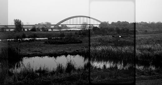
Still, I was not happy with the perspective, but I did like changing tones. So after a while, having looked and think about this concept, I decided to just use one image, divide it in four parts, edit them separately and stitch them back together.
Click the image to enlarge
That’s more like it. At least, that is my opinion. Some photo friends I showed this photo to, were not that enthusiastic.
Like to hear your thoughts on this set of photos (and the project).
Next week
I hope to wrap up my ‘Long-Term Photography Project’ series with a final chapter and a handy guide to help you start your own long term project. Now let’s see if I can find the time this week to work on that one.
That’s it for this newsletter.
Till next time,
DARKROOMS is a reader-supported, weekly photography newsletter. If you enjoy this newsletter, the best way to help it grow and support me is by becoming a free subscriber to receive new posts (or upgrade to support my work)
Looking for more Darkrooms content? Explore the full Darkrooms Archive anytime!
at the start i was like some of your friends, didn't like it. so i learn to do it in a "profesional" way which is: take a shot of the whole scene at 24mm, take the readings from the shot including the focusing point, input them in the camera, switch the camera to everything manual including the focusing (so the setting are even) and then with the lens at 70mm take series of shots in a certain order so i wouldn't have problem remembering when stitch them together.
later i've seen the work of david hockney and the way he did his "collages" and i have no problem if the edges of final image are not "evenly define" or the exposure is different from one image to other
The collage photo, not bad. The first thing that stands out is that the leftmost panel seems like a different color - a little browner than the others. So that stands out, which is not a good thing. I think I would prefer it if all the panels were processed similarly, if not the same. If making them all the same, your main tool would be a vignette. I wonder if you could play with focus/blur.