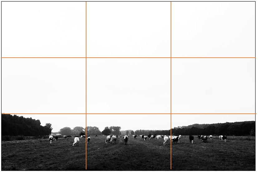
The Rule of Thirds is overrated
I have a bit of a struggle with the ‘rule of thirds’. While it is quite helpful in some ways, there are also obvious negatives to it. Below I will describe my biggest objections as well as my use of the "rule of thirds.
Rules limit your creativity
My biggest objection to the 'rule of thirds' is the fact that it is a rule. A rule is something you have to follow. That you have to behave according to the rules. And where most rules do serve a purpose - we all drive on the right (a few islanders aside) - I would prefer to think of this "rule" as a guideline.
After all, a guideline means you can use it. And that, of course, is much better than always applying it just because it's the way it should be. By breaking with this 'guideline' every now and then, you will get more surprising images than just the subjects in the same position in all photos. Boring!
So let your creativity flow and don't worry about those lines.
The rule is inadequate
It is not the right "guideline" in all situations and certainly not the only one. Although you can use the lines nicely to place the horizon or your subject at the intersections, sometimes it is better to place them right in the middle. Think, for example, of a landscape with reflections.
And what happens to your composition if you want to crop your image to another format such as 1:1, 5:4 or 16:9? Do you already take that into account when taking the picture? If so, do you have the grid set on your camera or not?
To put extra emphasis on the negative space, you can make sure that what "happens" in your photo is posted in the lower part. So below the line and not on the line/cutting point, in other words outside the lines.
Screw visual conventions
In addition, placing your main subject(s) at the intersections violates our natural viewing behavior. When we look at something, we see it right in the middle of our field of vision. We don't look with our heads slightly turned to get that subject 1/3 or 2/3 in focus. Right?
Check out this great video below by Stephen Shore, in which he also discusses the "visual conventions" we have apparently agreed upon. In this MoMa (Museum Of Modern Art) film, Shore says; “I question the visual convention” (at ~3:40 min.)
He did this particularly with the series American Surface, where he photographed everyday images of America. Just simply what he saw and how he saw it. Shame on the convention that the subject should not be completely in the middle, because that is how we look at a subject.
Deliciously contradictory, I love it!
That’s it for this newsletter.
Till next time,
Marcel Borgstijn
Just realized I wrote an earlier newsletter on something else being ‘overrated’; Talent.


I've heard this bull shit about rules for years. The "Rule" of thirds is simply a mathematical equation for what happens in nature which is pretty much based on the Fibonacci sequence. It's all math. Oh and, "Talent doesn't matter" That's usually said by the talentless.